Visual Weight Theory: The 2026 Guide to Finding Your Most Harmonious Makeup & Style
Why does ‘Clean Girl’ makeup wash you out, while ‘Mob Wife’ glam looks like too much? Visual Weight explains why trends don’t land the same on everyone.
You followed the tutorial exactly.
Same products. Same steps. Same lighting.
And yet, the result looks wrong on you.
Not bad. Just off.
Too flat. Too heavy. Too unfinished. Too much effort for too little payoff.
This isn’t a skill issue.
It’s a Visual Weight mismatch.
What Visual Weight Actually Means
Visual Weight is not a scientific measurement.
It is a pattern-based way of understanding how much visual information your features naturally carry.
Some faces register clearly with very little input.
Others need structure, contrast, or definition before they look balanced.
Visual Weight helps explain:
- why minimal makeup looks expensive on some people
- why others look better fully done
- why copying trends rarely works the same way twice
By 2026, the conversation has shifted from “what’s trending” to “what holds on you”.
That is where Visual Weight comes in.
The Three Visual Weight Categories
High Visual Weight
High Visual Weight faces hold strong structure or contrast naturally.
This often shows up as:
- prominent bone structure
- strong eyes, lips, or jawlines
- higher contrast between features and skin
On these faces, subtle makeup can look unfinished.
Bold elements act as balance, not excess.
Style tendency: definition first, softness second
Common mistake: trying to tone everything down
Medium Visual Weight
Medium Visual Weight faces sit in the middle.
They can handle both softness and structure, but not all at once.
These faces look best when there is one clear focal point.
Style tendency: adaptability
Common mistake: doing too many things at the same time
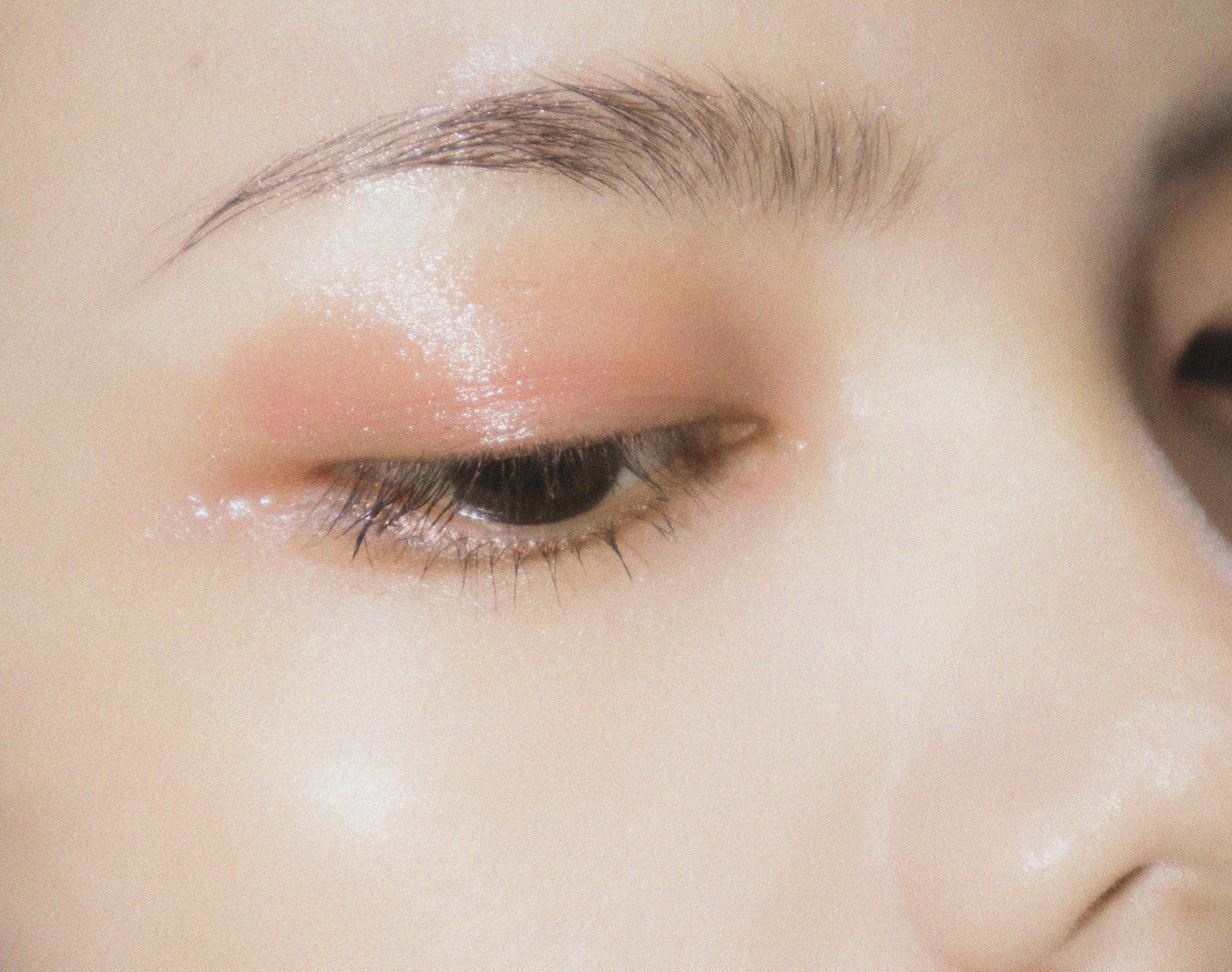
Low Visual Weight
Low Visual Weight faces carry softness and low contrast naturally.
Heavy makeup overwhelms these features instead of enhancing them.
Diffused textures and sheer products work better because they echo what is already there.
Style tendency: subtle clarity
Common mistake: forcing bold trends that bury the face
Why Trends Feel Inconsistent
Trends are designed for visibility, not harmony.
When a trend works on you, it is usually because:
- it matches your Visual Weight
- the product format suits your feature clarity
- the level of contrast aligns with your face
When it fails, it is rarely about taste.
It is about signal overload or signal loss.
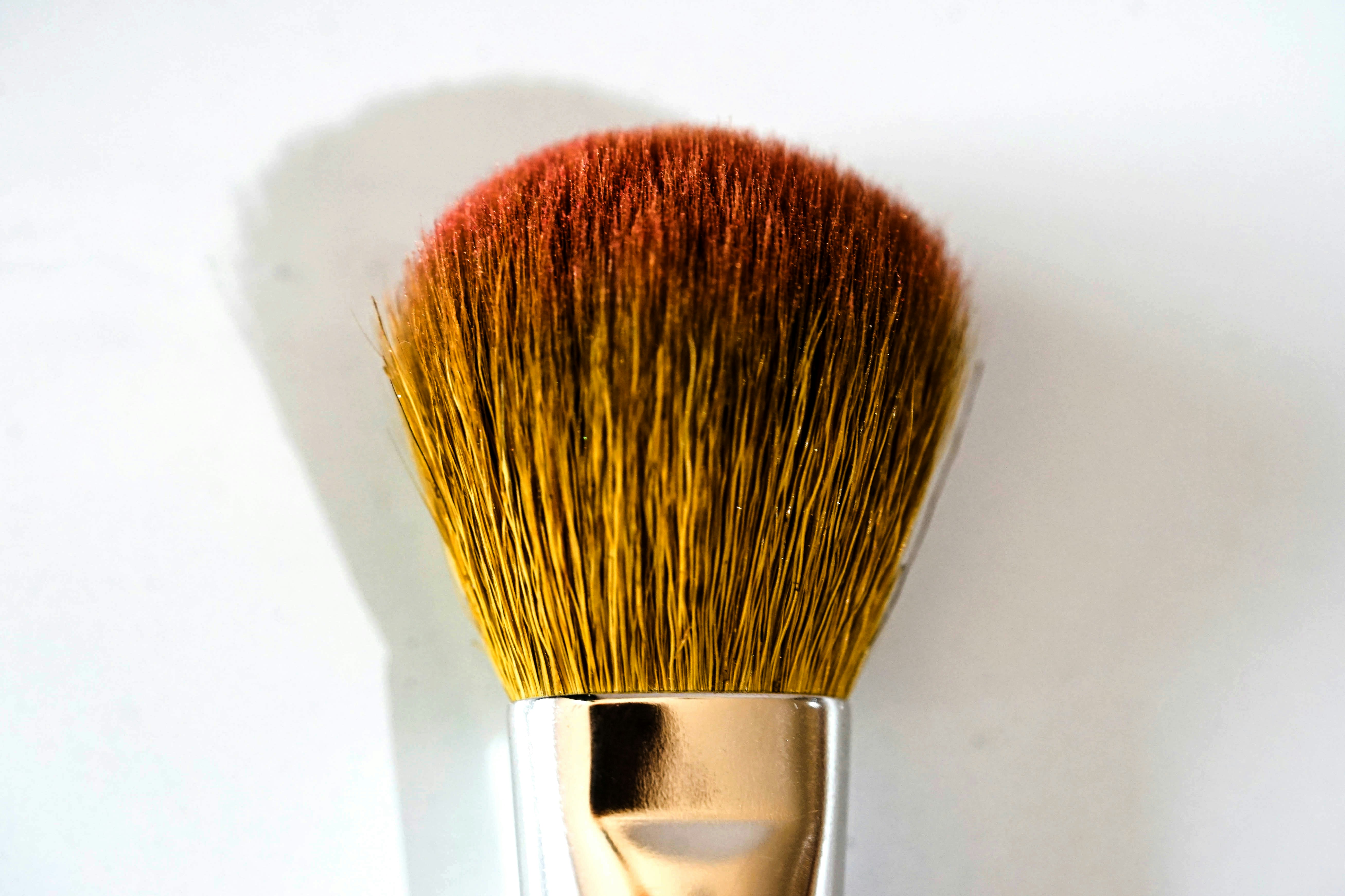
Makeup Strategy by Visual Weight
High Visual Weight Needs Structure
Products need to hold their own.
Pigment, shape, and staying power matter more than finish.
Medium Visual Weight Needs Control
Buildable products allow you to decide where attention goes.
One feature leads. The rest supports.
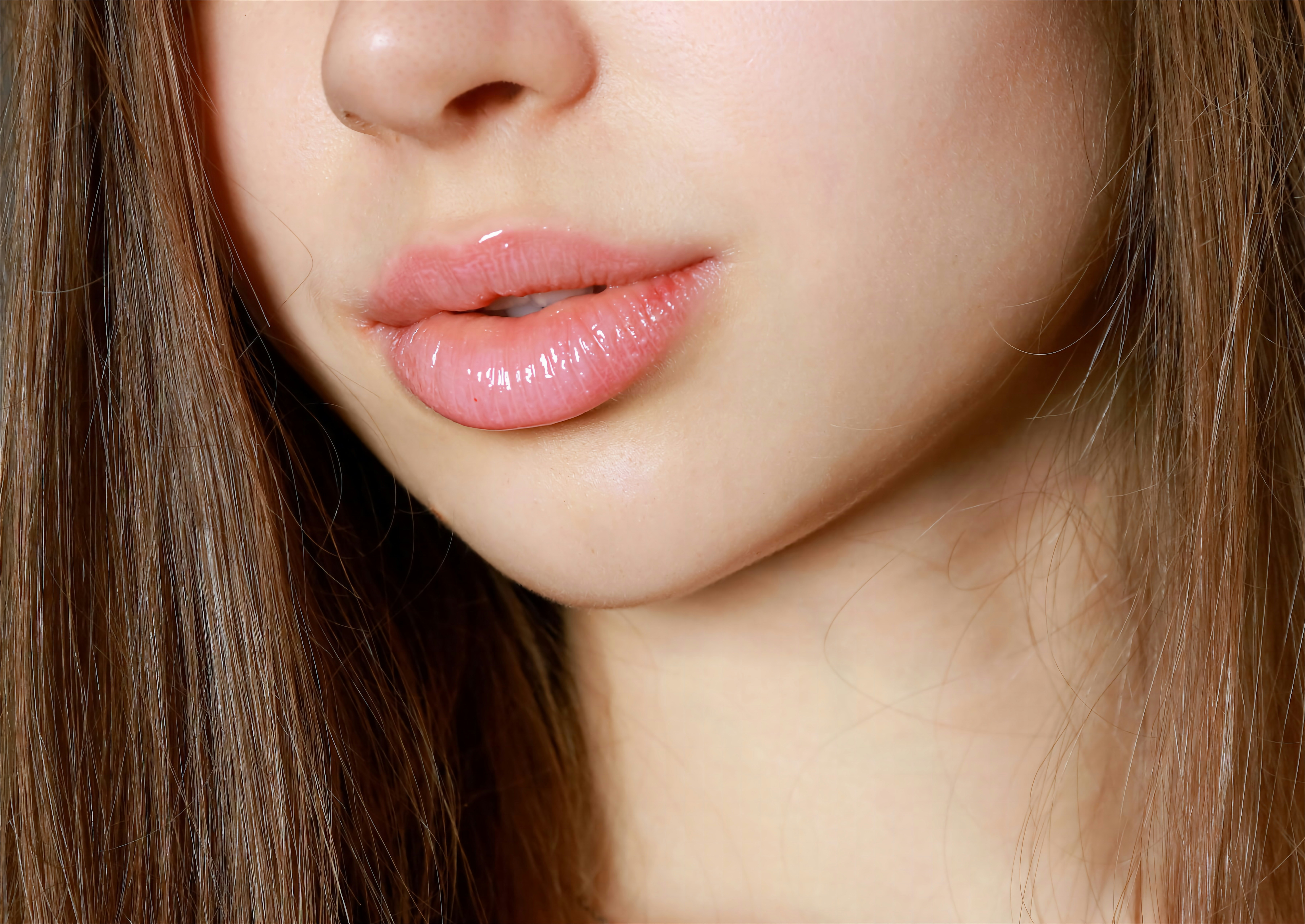
Low Visual Weight Needs Diffusion
Liquids and creams that melt into skin work best.
The goal is enhancement, not coverage.
Style and Accessories Matter Too
Visual Weight extends beyond makeup.
- High Visual Weight: larger earrings, thicker chains, structured bags
- Medium Visual Weight: texture over size, balance over symmetry
- Low Visual Weight: fine details, lighter metals, soft shapes
The wrong scale creates visual friction.
The right scale disappears into harmony.
The Point of Visual Weight
Visual Weight is not about boxing yourself in.
It is about understanding why some things feel effortless and others feel forced.
Once you know where you sit, you stop fighting your face and start working with it.
Unsure where you fall?
Take the Visual Weight quiz to find your starting point.
https://vibefind.me/quiz/visual-weight/
Disclaimer: Some links in this post are affiliate links. This means Vibefind may earn a small commission if you choose to make a purchase, at no additional cost to you. Products are recommended based on fit, function, and relevance to the topic, not sponsorship.